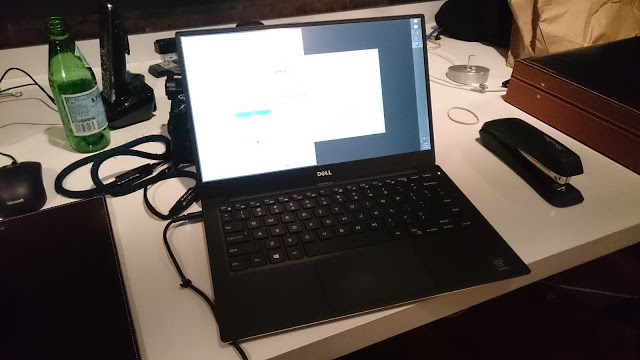
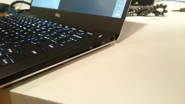
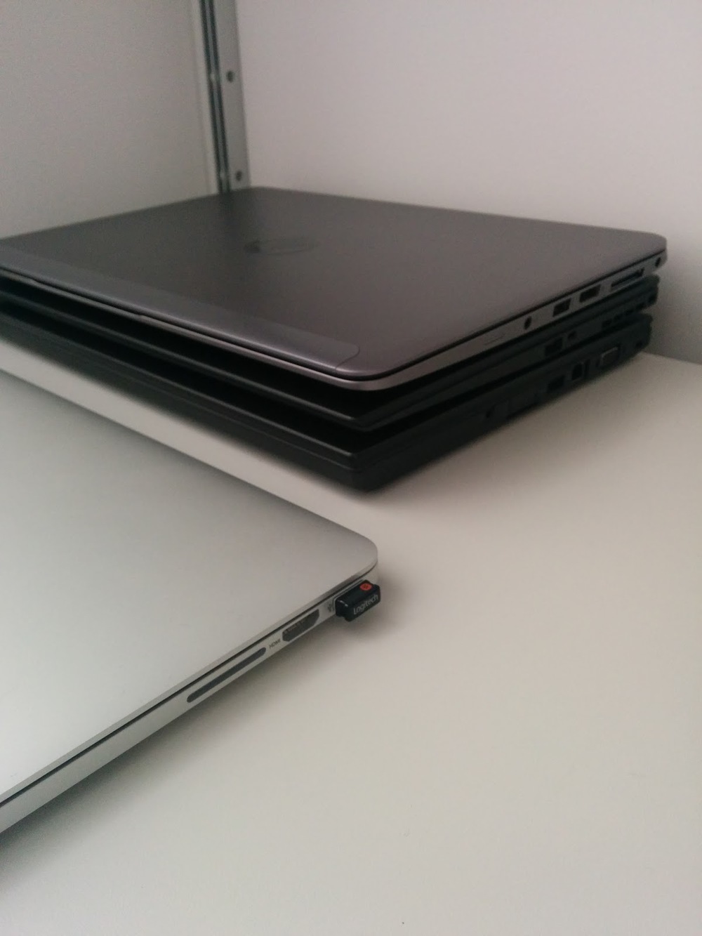
I bought all these laptops trying to find the best one to carry me through the next 12-18 months. I didn't mean to go through this many but I can't seem to settle on one and be happy with it.
What I'm looking for:
Runs Windows
Has at least a 1920x1080 screen
Has great colour and viewing angles
Has at least 8gb of RAM
Has at least 256gb SSD storage
Why?
I work with a lot of photos and graphics
I'm impatient
Macbook Pro Retina 13" (late 2013)
I used to bootcamp a Macbook Air in 2012, it was a good machine and I enjoyed using it for Windows. I've never warmed to OS X but the Apple hardware is definitely awesome. Thinkpad keyboards are still my favourite but the Macbook keyboard is good enough.
I found out: the Retina screen definitely has some QC issues. I exchanged 4 Macbook Pros until I got one I liked. There were noticeable colour casts in two corners, always green and red in opposite corners, definitely noticeable on a white background. I really appreciate Apple being flexible about returns. They let me keep opening up new Macbooks until I found the right one. When I did find eventually get the right screen, I was impressed. It's a really beautiful screen.
Using Windows on a Mac is generally a good experience. The drivers work decently and there are some basic two finger gestures for the touchpad. The biggest weakness is battery life. While you may see 8+ hours on OS X, you are likely going to find around 4-5 hours in Windows. This was also the case when I used to use a Macbook Air 2012 with Windows. Why is the battery life so much weaker in Windows? Perhaps unoptimized drivers?
Thinkpad X1 Carbon (2014)
I bought the i7 model with the 2560x screen.
Initial thoughts:
Screen is pretty nice but a lot of programs are really not ready for it. Particularly stupid is that Lenovo's own programs sometimes appear with miniscule icons when in 2560x. Screen is bright, it has a slight haziness due to the touch screen. Still, at least no screen-door effect.
The keyboard is a disaster. This adaptive row is driving me crazy. Firstly, it ships defaulting to controls rather than function keys, so things like brightness instead of F keys. You can switch between the different adaptive row layouts but you have to have minimum TWO (F keys + bright/vol/mic controls). They have some other ones like Internet Explorer control, too. .
The ESC key is gone from its usual spot. It's now next to 1. FN has replaced the ESC key.
Backspace is not the last key on the right edge of your keyboard now, DELETE is. Backspace is right next to that.
Double tap shift to caps lock works pretty nicely. I haven't really noticed the new location of the Home/End keys since I don't use them that often.
The feeling of the keyboard itself is good, actually feels a little better than my old X1 Carbon.
Touchpoint/pad. WHY. What was wrong with the original touchpoint buttons?
Nice bonus - comes with an ethernet dongle and a dedicated mini-proprietary port to plug it into.
All-in-all ... it's a nice laptop marred by very stupid design decisions on the keyboard. What the hell, Lenovo.
Update:

Originally Posted by
urbanglowcam 
Awesome, congrats! Can you comment a bit more on the display/panel? Glad there's no more screen door effect, though I was never really bothered by it. I just didn't like theclortemperature and viewing angles weren't the best. Have they improved on these things? Also, what do you mean by haziness from the touchscreen?
Also, are you surprised by the keyboard? Or did you do research and already know beforehand what you were getting yourself into? I hope that didn't come off rude.
Thanks!
For comparison, I also have this year's Macbook Pro Retina 13". The screen is similar but the Macbook Pro seems marginally brighter and with slightly better contrast. I have never had a touchscreen on my laptop before so I wonder how much of a difference the touchscreen overlay makes. I normally calibrate my screens so colour temperature is not too much of an issue. What is a bigger issue is poor contrast, which is usually a lot more eyestrain for me because I will crank up brightness to brighten the whites which increases legibility for me. The haziness is a slightly grainy look, I'll see if I can get a photo to explain. It's not that bad, I'm a stickler for screens that's all.
Compared the the last 1600x900 panel on the X1 Carbon, it's definitely an improvement BUT it really depends on if your eyes can handle that 2560x. It's definitely a bit too small for me at 100-125% scaling.
Not rude at all, it's an important question. I have used Thinkpads for ten years starting with the T23. I was ok with the major chiclet change but this new layout really takes the . I had seen all the notes about the adaptive strip, etc but I overlooked ESC has moved, which has been one of the more difficult changes for me to deal with. The actual feel of the keys when typing remains good and arguably the best out there.
What I would like to know is if the 1600x900 option is the same as the old X1 Carbon?
Update 2:
I just noticed, I can change the adaptive row to just show 1 row of stuff and be non-toggleable. However, practically speaking, two is still better for changing brightness and volume using hardware keys. Alternative is to adjust via windows settings.
TO BE CONTINUED
Brief Updates:
I bought the T440s and the HP Elitebook 1040 as well. I bought the T440s with a non-touch 1920x1020 panel.
I Found Out: there are two suppliers that can provide Lenovo with the parts for the T440s. LG and AUO. I got the LG version and it is unacceptable. The primary problem is its crappy viewing angle. The AUO is meant to be much better but I could not get a replacement part, Lenovo was out.
I Found Out: HP ... uses the same LG panel, suffers from the same problems. SUCH A SHAME. I was really impressed with the machine and was ready to jump ship until I saw that screen.

