Text by Mark Cho
My mission for The Armoury is to try and make tailored clothing more relevant and easy-to-wear. People today are dressing almost too casually and I want to create some resistance to that. I love tailored clothing and want people to understand and enjoy it as much as I do. So, at The Armoury we try to present tailored clothing in less serious ways and get people thinking: “I could wear that.”
Traditionally, we have liked to shoot images in the shop. If we were having a quiet afternoon and the light was right, we would turn off all the lights in the shop and just use natural lighting to create our images. If a customer came in, we would turn all the lights back on and get back to serving them. Our focus was usually on our customers’ bespoke or made-to-measure commissions and sometimes our own as well. We wanted to highlight new makers and craftsmen visiting our store for trunk shows. Above all, we wanted to try and create new and beautiful images.
As our online store has grown over the years, we faced a greater need to show our ready-to-wear items. Last year we shot our first lookbook, engaging an external photographer rather than doing it ourselves and putting two of our New York team in a studio wearing ready-to-wear outfits from the current season. It was well received and so we aim to try out some new ideas each season and see how it goes. We still continue to do our more candid, natural light and street photography style images as our bread and better throughout the year.
I’m fortunate enough to be friends with a talented menswear illustrator, Mr Slowboy. We wanted to do a project together and so the lookbook for FW 2016 was a good opportunity to see what might be possible.
I’m a big furniture junkie, particularly for designers like Poul Kjaerholm, Jorgen Hoj, Hans Wegner and Arne Jacobsen. Another friend of mine was recently appointed to run a new workspace / dining / bar concept in New York called Spring Place. The interiors are some of the best I’ve ever seen and very much in the aesthetic of the designers I love. So, I asked if I could do the shoot on their premises, which he kindly agreed to.
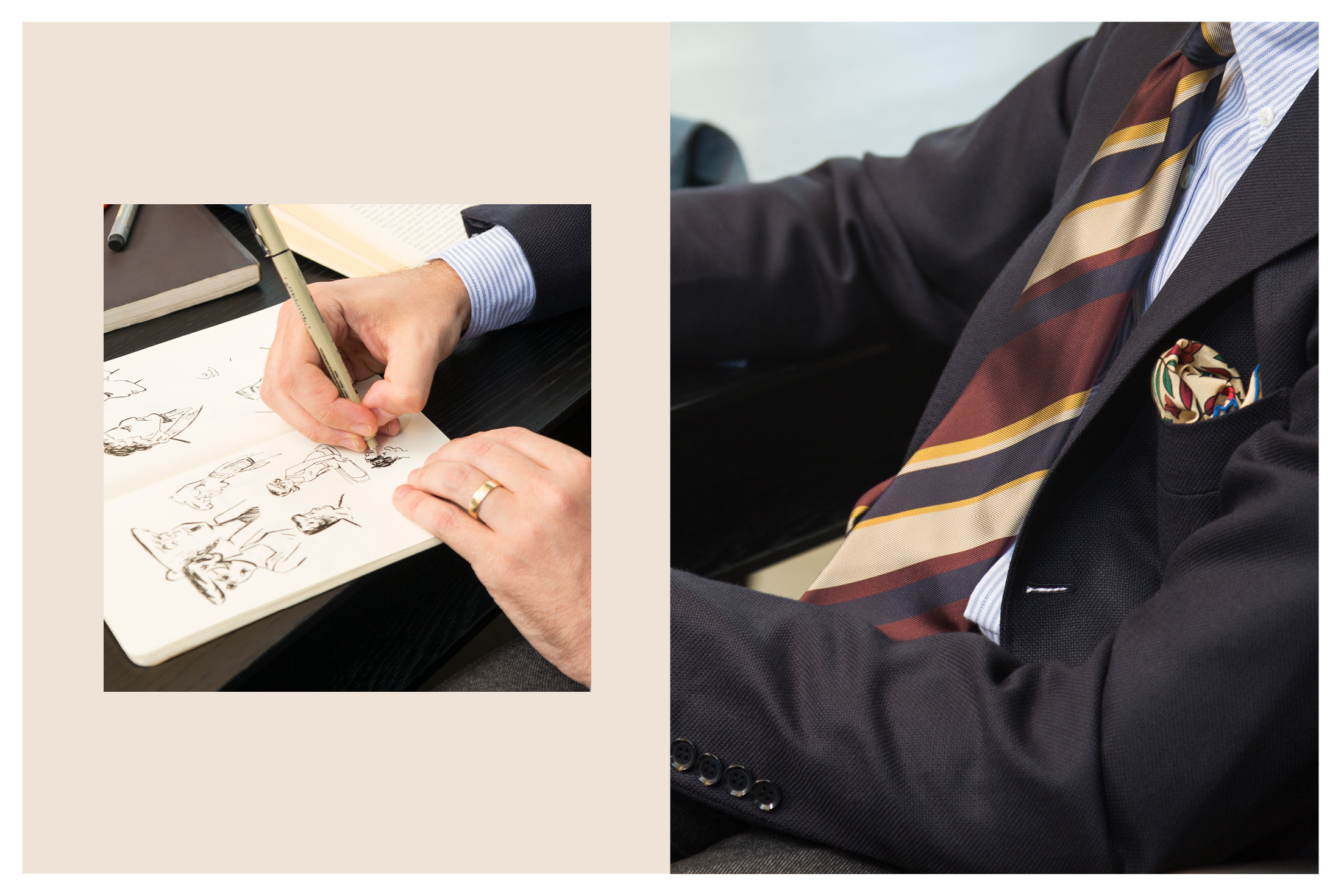
The idea with Mr Slowboy was to do draw in some Roger Rabbit style illustrated figures interacting with real people. The people and the environments would be more conservative, classic, flat imagery and the illustrations would bring it to life. Jim, the redhead, is our New York shop manager and a great musician. Rich, the non-redhead, is one of our sales guys and also a fantastic illustrator. The two of them wore this season’s ready-to-wear and I wore some of my own bespoke pieces from the different makers The Armoury represents. The illustrated character is someone Mr Slowboy came up with, a mix of different people at The Armoury. We named him Arthur, after the lion in our logo. He also wears items from this season.
We planned the images, then shot them and drew the illustrations. We then looked for an order to the images and a theme to tie it all together. Since the space we were in was a workspace / dining / bar concept, we decided to call it “Work and Play”, to suggest that The Armoury and the clothes could be not just for the office but also for relaxation after work. I thought it would be nice to add a little timestamp in the corner of each image to give a bit more context. It was a fun project to execute, I like the concept and I wish I had more time to refine it into a longer series but it has made for a memorable start to 2016’s Fall Winter season at The Armoury!


